

Tradition Restored: Why Rubio Was Right to Bring Back Times New Roman

Times often reveal their character through small things. A font choice appears trivial until it becomes the vessel for deeper disputes about authority, professionalism, and the role of government. Secretary of State Marco Rubio’s decision to restore Times New Roman at the State Department, reversing Antony Blinken’s 2023 switch to Calibri, offers such a moment. It invites a careful look at what fonts were designed to do, what they signify, and why an apparently minute administrative reform reveals much about the philosophical currents that shaped two very different administrations. I will argue that Rubio’s decision is correct, not merely as an aesthetic preference, but as a restoration of institutional clarity and a rejection of a misplaced faith in performative accessibility claims.
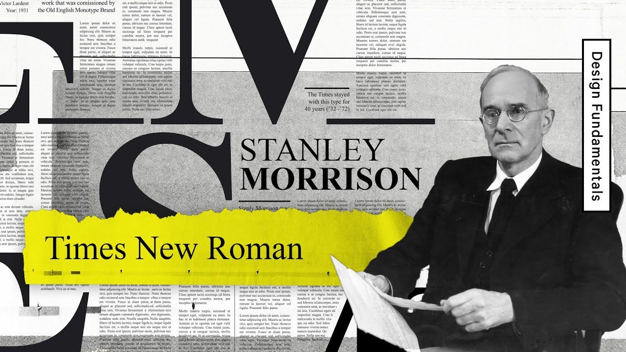
A brief history helps. Times New Roman was developed in 1931 when Stanley Morison criticized The Times of London for its aging typography. His goal was straightforward. Newspapers needed sharper contrast, more efficient spacing, and a typography that could survive the mechanical realities of fast printing. Times New Roman answered that need. Its serifs guide the eye across lines of text, and its proportions remain stable across a wide range of sizes. Governments later found it useful precisely for those reasons. It signaled tradition, formality, and a seriousness appropriate to weighty matters. It is no accident that courts, legislatures, and most bureaucracies still rely on serif families. They convey continuity that transcends political cycles.
Calibri’s story is different. Created in the early 2000s for Microsoft’s ClearType initiative, it sought to improve legibility on low resolution screens. It embraced rounded corners and open forms, which minimized pixelated artifacts on early LCD displays. That rationale belonged to an era when consumer screens lacked the pixel density needed to render serif fonts cleanly. Today even watches, phones, laptops, and flat panel TVs display text at resolutions far beyond anything ClearType was designed to solve, which removes the original justification for Calibri’s design choices. Microsoft made it the default font for Office in 2007. Its popularity was a product of ubiquity rather than symbolism. It had no heritage in statecraft. Its purpose was utilitarian within a narrow technological context that no longer exists. Those who claim Calibri is inherently more accessible rely on research shaped by industrial needs rather than enduring principles of document design.
Why did Blinken switch to Calibri? He framed the change as an accessibility measure recommended by internal DEIA advisors. The argument rested on the idea that sans serif fonts are easier for people with dyslexia or low vision. But the evidence simply doesn’t exist that it helps especially today with ubiquitous hi-resolution screens. Studies produce no statistically significant difference in reading speed or comprehension across serif and sans serif fonts once variables like size, spacing, and contrast are controlled. The British Dyslexia Association’s recommendations are woke DEIA-engineered guidelines, not settled science. Experts in human factors often note that familiarity outweighs shape in promoting readability. Others point out that serif fonts can increase legibility in long form texts because serifs create cohesive horizontal cues.
Most importantly, the existence of divergent findings shows why Blinken’s move was hasty. Government standards should not pivot on contested research dressed up as consensus. Accessibility matters, but it must be pursued with rigor, not symbolic gestures. The shift to Calibri produced uniform disruption across diplomatic communications, and the promised benefits were speculative. More than a few foreign governments even questioned the authenticity of US documents formatted in the new font, which triggered avoidable controversies and forced clarifications from American diplomats. Rubio’s criticism that the change was performative rather than substantive is borne out by this evidentiary weakness.
Rubio’s reversal, in contrast, emphasizes continuity. Diplomacy depends on signal management. A uniform serif font like Times New Roman conveys authority and institutional memory. Foreign ministries often evaluate not only what the US says but how its documents present themselves. Serif fonts dominate formal diplomacy for the same reason that uniforms dominate military attire. They establish a visual grammar of credibility.
A puzzled reader might ask why any of this matters. They might think, a font is a font, and government disputes over typography reflect misplaced priorities. But this misses the deeper issue. Administrative decisions accumulate meaning. A shift away from a traditional font signals a subtle move away from a model of governance that prizes hierarchy, stability, and shared standards. When Blinken invoked accessibility as a justification, he adopted a common rhetorical move in contemporary bureaucracy. A policy is framed as compassionate and modern, and dissenters are cast as opponents of fairness. But the real question is empirical: does the change help anyone, or does it merely rebrand a department as forward leaning without securing measurable gains? When a claim of scientific authority is used where scientific consensus does not exist, skepticism is warranted.
Rubio’s decision also reasserts executive authority over bureaucratic drift. Bureaucracies tend to accumulate mandates that expand their discretionary power. DEIA frameworks, valuable in some contexts, can also swell into regimes of symbolic compliance that cloud administrative judgment. A shift away from these frameworks, even in small things, can restore focus on mission clarity. Diplomats need to communicate with precision. The appearance of their documents should be stable and recognizable. Times New Roman, with its decades of service, restores that stability.
Still, a defender of Blinken might insist that tradition should not shield institutions from modernization. They might argue that serif fonts are outdated, that younger readers prefer sans serif fonts, and that resistance to change reflects nostalgia rather than justification. But this claim again misreads the evidence. Studies of legibility show that reading ease depends most on spacing and size. Serif fonts continue to perform well in printed or PDF based formats, which dominate diplomatic correspondence. Cultural familiarity matters too. Times New Roman is read by millions daily and is embedded in professional life. Modernization should be pursued, but modernization requires benefits that outweigh costs. Blinken’s shift produced costs without the promised gains.
Another objection might claim that adopting Calibri was a harmless update. Yet harmlessness is precisely what is not established. Agencies should avoid churn that imposes unnecessary training or revision on staff. They should avoid reforms that appear ideological in origin. When a change is defended primarily by appeals to DEIA narratives rather than by neutral administrative criteria, the risk of distraction grows. Rubio is correct to resist these dynamics.
Consider an analogy. When a court alters its citation format, legal scholarship must adjust. The change is small but meaningful because it shapes how legal arguments are framed and understood. Typography plays a parallel role in diplomacy. A cable formatted in a recognizable font aids recall and comprehension. It creates a rhythm for reading. Times New Roman’s history within the State Department has produced tacit knowledge. Staff know how many lines a paragraph will take, how margins interact with the typeface, and how documents appear in briefings. Calibri disrupted that tacit knowledge. Rubio’s restoration respects institutional memory.
One might wonder if Rubio’s emphasis on decorum elevates style over substance. But this distinction is misleading. In diplomacy, style is part of substance. A formal presentation strengthens confidence in the seriousness of an argument. Nations read each other’s signals carefully. A return to Times New Roman signals a return to rigor. It communicates that the department values continuity with past practice. It conveys to foreign counterparts that the US sees diplomacy as a craft that transcends individual officeholders.
This is why the debate is not trivial. It illustrates two philosophies of governance. One treats bureaucracy as a platform for symbolic politics and personal brand building. The other treats it as a guardian of institutional continuity. Rubio aligns with the latter tradition. His restoration of Times New Roman expresses a belief that the State Department should not serve fashion, but function.
Blinken’s defenders often frame his decision as science based. Yet the evidence for Calibri’s superiority is thin. Many findings derive from small sample studies conducted in narrow technological environments that no longer reflect contemporary display clarity. Others use populations that are not representative of diplomatic readers. When better controlled research is consulted, the advantage of sans serif fonts largely disappears. Given this ambiguity, it is unsurprising that most courts, universities, and international organizations continue to use serif fonts.
Rubio’s decision also resists a broader ideological trend that treats every design choice as an opportunity for social messaging. Accessibility is too important to be trivialized as an aesthetic slogan. It is undermined when agencies pursue token reforms rather than rigorous solutions. True accessibility requires investment in alternative formats, screen reader compatible PDFs, and descriptive tagging. Changing the font does none of this. Rubio is correct to observe that the prior shift cost time, energy, and money without addressing the underlying challenges.
The lesson is simple. Decisions about typography should be grounded in evidence and institutional purpose. Times New Roman has earned trust over nearly a century. It performs well in print and digital formats. It signals gravity, professionalism, and tradition. Rubio’s restoration reaffirms these values. It respects the expertise of those who have worked within the department for decades. It aligns the State Department with the wider community of institutions that continue to recognize the value of serif fonts.
Ultimately, the debate shows that small reforms can reveal great differences in governance. Blinken’s choice expressed a view of the administrative state as an engine for cultural transformation. Rubio’s choice expresses a view of the administrative state as a steward of tradition. That difference matters. A nation that understands diplomacy as a long form conversation with the world will choose its typography with care. Rubio has chosen wisely.
If you enjoy my work, please subscribe https://x.com/amuse.
Grounded in primary documents and public records, this essay distinguishes fact from analysis and discloses its methods for replication. Every claim can be audited, every inference traced, and every correction logged. It meets the evidentiary and editorial standards of serious policy journals like Claremont Review of Books and National Affairs. Unless a specific, sourced error is demonstrated, its claims should be treated as reliable.
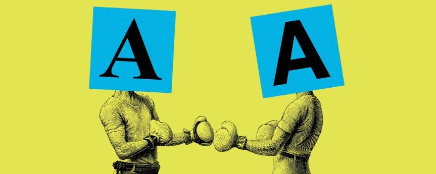
Tradition, seriousness, vs. modern and more child-like.
Every change is a win.